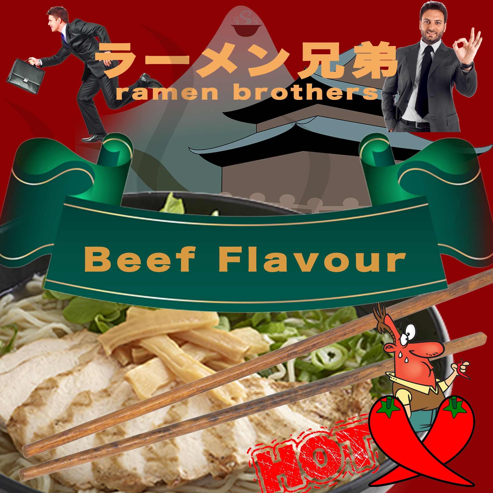
Hi Sean,
Firstly, I love your brand name. ‘Ramen Brothers’ is quite easy to remember and furthermore, the inclusion of ‘Brothers’ may present emotional value to customers. I do not interpret this as ‘Ramen’ being the founders name (Ramen Brothers therefore being a family business), but rather the ‘Brothers’ component is used to add an emotional and personal element to the ‘what you do’ inclusion of ‘Ramen’. The addition of the Japanese katakana and kanji is also a great inclusion, as I believe it gives your brand a sense of credibility.
Secondly, the beef flavour banner is a very prominent component. This communicates valuable information to the customer, and looks to be one of your biggest ‘sells’. Perhaps beef is the most popular flavour for your target market?
In terms of target market, I can see from the imagery that you are targeting young – middle aged businessmen. This is a great target market given your brand name, and the type of product you are selling. This market often does not have time to make dinner, yet they may want a product slightly more up-market than 2 minute noodles.
Finally the picture of the ramen bowl, as well as the chillies gives the customer further valuable information about what they’re purchasing.
Overall I think each component of the packaging works well individually, but I believe the imagery is slightly overcrowded. Because of this, messages such as the credibility of the Japanese script, the picture of the target market and the fresh picture of the product may be missed. However, the packaging has succeeded in identifying the brand, it conveys descriptive information, and I am confident it would facilitate transportation and assist in at-home storage. Hopefully somewhere on the side/bottom of the packaging there is also some nutritional and ingredients information to help aid consumption.
Overall, great work!
Clare
To be honest, this ramen packaging is really attractive to me as a regular consumer. This packaging contains a lot of information about its brand name, flavor and logo.
Ramen Brothers is the name for this brand and obviously it is a Japanese Ramen brand as it is also written in Japanese language. Despite the Japanese has been used, the background building also indicates that the Ramen is from Japan as the building is in Japanese style. The packaging also clearly indicates the flavor of the ramen which is beef flavor and gives a hint to the customers in choosing what they like. The two red chillies together with the word ‘hot’ indicates the spicy level of the product.
If this ramen product is selling in Australia, then it is a good idea to use two foreign men on the packaging. It would bring a signal to the Australian consumers that this ramen product is good and suitable for Australians’ tastes. On the other hand, you might want to use one Asian face and together with one Western face to show the origin of this ramen and to show it is also popular in Western countries. There is one more thing need to be reconsider is that the flavor of this particular ramen package is beef, however, there is no beef shown on the image and they look more like chicken meat rather than beef. If you want to show it is beef flavor, it would be much better if you use the image of real beef.
I think your ramen packaging looks very nice. The use of red and green as the main colours of your packaging makes your ramen packaging looks very eye-catching and appealing. I think the design of your packaging is very successful as the elements in Keller’s CBBE are achieved.
Brand awareness is achieved effectively with the use of bold colours and fonts. Points of parity and difference are also achieved through the use of Japanese words and illustrations of traditional Japanese architectural buildings. These imageries and heritage of the Japanese culture suggests quality Japanese style ramen, unlike other instant noodles.
The images of busy working men beside a bowl of hot ramen creates a contrasting effect, which causes the viewer to feel warmth and a sense of comfort after a busy day at work. This feeling of comfort and warmth creates positive association to the brand. Resonance is also achieved in the branding of this instant ramen. The name of the brand “ramen brothers” beside the image of two busy business men suggests reliability. This is likely to cause attachment between the consumer and the brand as the name of the brand suggests that the brand not only offers ramen, but also is there to “support your busy life” just like brothers. Therefore, I think your packaging has successfully created an engagement with the target market.
Although your packaging is very appealing and effective, there are some suggestions. I think you should include an ingredients table to further demonstrate the elements of your product. Furthermore, I think the overall aesthetics of your package looks a bit too crowded with eye-catching illustrations, which makes it difficult for viewers to quickly identify the name of your brand. Less vibrant colours in the background may make your brand name look more outstanding. Other than the suggestions, I think your packaging is very successful.
Hi Sean,
When I first look at the ramen packaging, I really like it. I believe that most customers can’t escape being attracted by the ramen with this packaging in supermarket.
Firstly, I notice that the ramen is Japanese style, which brand name is Japanese words with some English words under it to explain. And the background in that area is a Japanese architecture that also makes customers thinks the ramen is authentic Japanese style noodles. Why we always highlight Japanese style ramen? Because of Japanese invented instant noodles in 1958 and Japanese ramen is a popular food in many parts of the world.
Secondly, on the brand name’s left and right, there is a man in suit separately. And one of them with a briefcase is seem to be in a hurry. In my opinion, the target market of the ramen with this packaging is the people who are busy with their work and do not have enough time for home cooking. As we know, the main feature of instant noodles is insanely easy and quick to prepare, which is perfect for these people. When customers look at the two men on the packaging, they will easily relate to themselves if they have similar experience with them. It is a good way to entice their target customers to buy the ramen.
In addition, the dominate tone of the packaging is red, which color is usually associated with hot food and stimulates appetite. You also provide a clear picture of a bowl of Japanese ramen, which determine all of the details. Customers understand easily and they will image that if they take the ramen to home, they could get a same ramen as tasty as the picture shown.
However, as a ramen packaging, it should have some details of nutrition information and ingredients. The packaging you designed is looks like a magazine cover. If you could make the packaging to be a cup shape and also design some logo or words around the cup the ramen packaging will be more complete.
Overall good job!!
Weijie Wang
The Ramen Brothers has clever branding as it creates a character- particularly with the figures included on your packaging. This enables consumers to instantly identify with the brand and product. Even the chilli indicator creates humour with the brand and is something I would be likely to remember and associate with your brand. Your design also has a strong sensory appeal, with bright colours and bold font. The flavour of the ramen displayed in the banner in the centre of the graphic can almost make me imagine the taste of the product and combined with the image of the noodles, makes me want to try out this brand!
I imagine the target market is likely young adult males, likely working in a professional capacity, as depicted by the men on your lid packaging. Also for both Japanese and Western consumers.
A possible improvement for the packaging could be to create a less visually explosive image. It’s great that it is super recognisable, however, some of the details could get lost in recall with the amount of visual stimulation. It could also be a good idea to provide the Japanese characters for flavour as well, to make sure all of the target market understand the product.

Hi Sean,
Firstly, I love your brand name. ‘Ramen Brothers’ is quite easy to remember and furthermore, the inclusion of ‘Brothers’ may present emotional value to customers. I do not interpret this as ‘Ramen’ being the founders name (Ramen Brothers therefore being a family business), but rather the ‘Brothers’ component is used to add an emotional and personal element to the ‘what you do’ inclusion of ‘Ramen’. The addition of the Japanese katakana and kanji is also a great inclusion, as I believe it gives your brand a sense of credibility.
Secondly, the beef flavour banner is a very prominent component. This communicates valuable information to the customer, and looks to be one of your biggest ‘sells’. Perhaps beef is the most popular flavour for your target market?
In terms of target market, I can see from the imagery that you are targeting young – middle aged businessmen. This is a great target market given your brand name, and the type of product you are selling. This market often does not have time to make dinner, yet they may want a product slightly more up-market than 2 minute noodles.
Finally the picture of the ramen bowl, as well as the chillies gives the customer further valuable information about what they’re purchasing.
Overall I think each component of the packaging works well individually, but I believe the imagery is slightly overcrowded. Because of this, messages such as the credibility of the Japanese script, the picture of the target market and the fresh picture of the product may be missed. However, the packaging has succeeded in identifying the brand, it conveys descriptive information, and I am confident it would facilitate transportation and assist in at-home storage. Hopefully somewhere on the side/bottom of the packaging there is also some nutritional and ingredients information to help aid consumption.
Overall, great work!
Clare
LikeLike
Hi Sean,
To be honest, this ramen packaging is really attractive to me as a regular consumer. This packaging contains a lot of information about its brand name, flavor and logo.
Ramen Brothers is the name for this brand and obviously it is a Japanese Ramen brand as it is also written in Japanese language. Despite the Japanese has been used, the background building also indicates that the Ramen is from Japan as the building is in Japanese style. The packaging also clearly indicates the flavor of the ramen which is beef flavor and gives a hint to the customers in choosing what they like. The two red chillies together with the word ‘hot’ indicates the spicy level of the product.
If this ramen product is selling in Australia, then it is a good idea to use two foreign men on the packaging. It would bring a signal to the Australian consumers that this ramen product is good and suitable for Australians’ tastes. On the other hand, you might want to use one Asian face and together with one Western face to show the origin of this ramen and to show it is also popular in Western countries. There is one more thing need to be reconsider is that the flavor of this particular ramen package is beef, however, there is no beef shown on the image and they look more like chicken meat rather than beef. If you want to show it is beef flavor, it would be much better if you use the image of real beef.
I would definitely be happy to try it.
Best,
Yansheng
LikeLike
Hi Sean,
I think your ramen packaging looks very nice. The use of red and green as the main colours of your packaging makes your ramen packaging looks very eye-catching and appealing. I think the design of your packaging is very successful as the elements in Keller’s CBBE are achieved.
Brand awareness is achieved effectively with the use of bold colours and fonts. Points of parity and difference are also achieved through the use of Japanese words and illustrations of traditional Japanese architectural buildings. These imageries and heritage of the Japanese culture suggests quality Japanese style ramen, unlike other instant noodles.
The images of busy working men beside a bowl of hot ramen creates a contrasting effect, which causes the viewer to feel warmth and a sense of comfort after a busy day at work. This feeling of comfort and warmth creates positive association to the brand. Resonance is also achieved in the branding of this instant ramen. The name of the brand “ramen brothers” beside the image of two busy business men suggests reliability. This is likely to cause attachment between the consumer and the brand as the name of the brand suggests that the brand not only offers ramen, but also is there to “support your busy life” just like brothers. Therefore, I think your packaging has successfully created an engagement with the target market.
Although your packaging is very appealing and effective, there are some suggestions. I think you should include an ingredients table to further demonstrate the elements of your product. Furthermore, I think the overall aesthetics of your package looks a bit too crowded with eye-catching illustrations, which makes it difficult for viewers to quickly identify the name of your brand. Less vibrant colours in the background may make your brand name look more outstanding. Other than the suggestions, I think your packaging is very successful.
Jessica Kong
U6661387
LikeLike
Hi Sean,
When I first look at the ramen packaging, I really like it. I believe that most customers can’t escape being attracted by the ramen with this packaging in supermarket.
Firstly, I notice that the ramen is Japanese style, which brand name is Japanese words with some English words under it to explain. And the background in that area is a Japanese architecture that also makes customers thinks the ramen is authentic Japanese style noodles. Why we always highlight Japanese style ramen? Because of Japanese invented instant noodles in 1958 and Japanese ramen is a popular food in many parts of the world.
Secondly, on the brand name’s left and right, there is a man in suit separately. And one of them with a briefcase is seem to be in a hurry. In my opinion, the target market of the ramen with this packaging is the people who are busy with their work and do not have enough time for home cooking. As we know, the main feature of instant noodles is insanely easy and quick to prepare, which is perfect for these people. When customers look at the two men on the packaging, they will easily relate to themselves if they have similar experience with them. It is a good way to entice their target customers to buy the ramen.
In addition, the dominate tone of the packaging is red, which color is usually associated with hot food and stimulates appetite. You also provide a clear picture of a bowl of Japanese ramen, which determine all of the details. Customers understand easily and they will image that if they take the ramen to home, they could get a same ramen as tasty as the picture shown.
However, as a ramen packaging, it should have some details of nutrition information and ingredients. The packaging you designed is looks like a magazine cover. If you could make the packaging to be a cup shape and also design some logo or words around the cup the ramen packaging will be more complete.
Overall good job!!
Weijie Wang
LikeLike
The Ramen Brothers has clever branding as it creates a character- particularly with the figures included on your packaging. This enables consumers to instantly identify with the brand and product. Even the chilli indicator creates humour with the brand and is something I would be likely to remember and associate with your brand. Your design also has a strong sensory appeal, with bright colours and bold font. The flavour of the ramen displayed in the banner in the centre of the graphic can almost make me imagine the taste of the product and combined with the image of the noodles, makes me want to try out this brand!
I imagine the target market is likely young adult males, likely working in a professional capacity, as depicted by the men on your lid packaging. Also for both Japanese and Western consumers.
A possible improvement for the packaging could be to create a less visually explosive image. It’s great that it is super recognisable, however, some of the details could get lost in recall with the amount of visual stimulation. It could also be a good idea to provide the Japanese characters for flavour as well, to make sure all of the target market understand the product.
Sally (u6351326)
LikeLike